
A UX Case study for a food delivery app
Description: Fooditsy is a food delivery app idea or a feature designed to fulfil specific needs of user. It helps users to plan meals in advance like a tiffin system and get it delivered advance in time.
My Role: Research, Usability Testing, Personas, Wireframing, UI
Tools: Adobe XD, Invision, Miro
Duration: 10 weeks

Research
OVERVIEW and problem identification
From whatever food delivery option is available in the market none of them allow users to advance order their meals for the whole week or a month.
There is no last minute add-on options. Once the order is placed there is no space to add-on to the current order, the only way is to make a whole new order again.
Through usability testing of some existing apps, I discovered that many users struggled with navigation within the app to find relevant features that they wanted to use. Based on my research findings, I designed some solutions and validated them further with additional usability tests.
GOALS
I was not trying to solve a problem for everyone, just solving well for a focused group of people, hence evaluated some customer experiences of our target audience by giving them tasks.
Some of the observations and key points that came out of it were:

Out of these 2 user goals and respective features were identified:
No worries about his his meals - Advance order, Alarm feature/reminders, Suggestions, Promotions, Health check/Calorie check, Tracking of orders
Ease of use of the order process/more flexible- Real time adding of orders in the current order, Order tracking, Sign up, Feedback, Nearby restaurants, Cancellation feature, Reviews of food/services
We then performed some user interviews by preparing a set of questions.

Define
PERSONA
I also defined a main customer persona thanks to the qualitative interviews we conducted through online meetings and face to face meet up.

IDEATE
After the research, started to sketch first few ideas starting with a storyboard driven by the data collected. Then started to to design some of the wireframes on Adobe XD. Decided to test early with some paper prototyping first with the user/stakeholder.
STORY BOARD


WIREFRAMES
With the most important features I did some paper low fidelity wireframes and then on XD to see how it might look like. Just an idea before actual implementation. This helped in coming up some information architecture and sitemap.


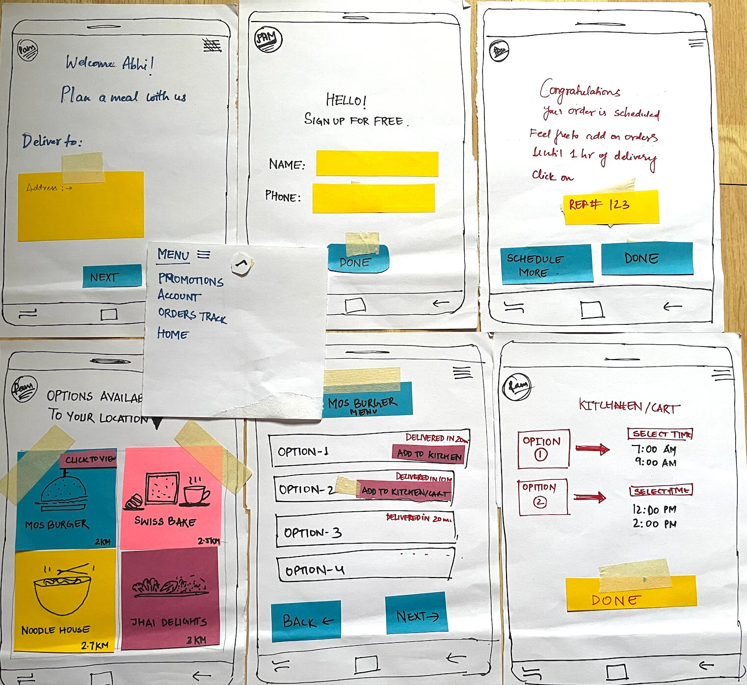
Paper Prototypes
Conclusions
After getting the minimal viable product the the project, it was time for some brand identity guideline and then it would be ready for some development phase.
In conclusion, the takeaways of the research findings after interviewing the users were
They were excited about the concept.
They can have a healthy lifestyle without cooking for themselves.
They can focus more their work.
Help them manage budget as they can get a weekly/monthly estimate. Some user expect they might get better deal for bulk orders.
It was one of my first major projects in UX and helped me uderstand the entire UX process mainly how much the research is important. Learnt that we should not go into assumptions and really get our hands dirty with designs, interviews and overall research.